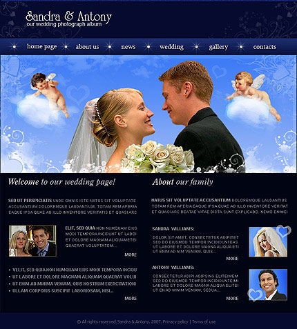
Once upon a time, the bride and the groom might have their own wedding website if they were web designers, wanted to cough up the dough to have someone design a wedding website for them, or they were content to muck about with a free website that wasn’t wedding-themed, but got the job done. Then came the low-cost customized wedding websites and the free (but still pretty good) wedding websites, and it wasn’t long before having a wedding website wasn’t a novelty, but something every bride and groom ought to do if they love their guests even a little bit.
Full disclosure: I made a wedding website for myself and The Beard, and I wish I could link to it but it’s nowhere to be found. We tossed up a few pics, our non-registry info, directions, and info about hotels, and then we made up a very silly how-we-met story that had people raising their eyebrows. We did not post pictures of ourselves from infancy or give lengthy bios of our wedding party or way too much personal information a la those wacky Christmas letters that let one and all know that Jimmy won his school spelling bee championship!

Would Double X’s Noreen Malone have approved of our wedding website? Doubtful, considering she simply cannot stand the things.
My roommate and I spent a solid hour on the couch one evening discussing a wedding Web site we’d been sent. The people getting married were strangers, but that didn’t stop me from forwarding it to a friend or two I thought might get a kick out of it. In the months preceding their marriage you can watch the Flash slide show that explains how [Jane and Tim] met while rooting for opposing teams during a Yankees-Red Sox game as many times as you want. But that’s only if you tire of the video showing Jane and Tim lovingly washing their dog, Mr. Snuffles.
Jane and Tim have chosen to color their special story various shades of soft green, with tan accents of faux ribbons, shadowed floral flourishes, and a highly stylized fake script font. The vibe is perhaps meant to be “classy,” but it’s very hard to achieve an understated aesthetic when the message you most want to telegraph is LOOK AT ME. The main page features a black-and-white shot of Tim adoring Jane while she reciprocates with the upturned chin angle that telegraphs true, moony love, taken during the couple’s (extensive) engagement photo shoot. Visitors can choose one of several unrecognizable soft-rock songs while they browse (but no mute button option). There are a grand total of 651 pictures featured—from baby photos to Solo-cup-filled college dorm-room shots to shots of their four—count ’em—engagement parties.
Instead of being tasteful, utilitarian affairs, these sites inevitably turn into showcases for unbridled narcissism—and open the couple up to a great deal of mockery from friends and strangers alike.
Do you agree? Have you created your own wedding website or paid someone to create it for you? As for my opinion, I think they can be a tad annoying when overdone — autoplay music doesn’t belong anywhere, and I do hope that if I’m attending your wedding I at least have some notion of how you and your intended met — and there are plenty of other ways to find out where a venue is… hello, Google Maps! Still, if your wedding website sucks (which I’m sure none of yours do, natch) then all I have to do is close Firefox and never visit your URL again.


